Squarespace websites are all the rave these days, and rightfully so. I am a graphic designer that also dabbles a little in web design, so I prefer an easier way of creating a website that doesn't involve too much coding knowledge. When I first started blogging 8 years ago and up until last December I was using the Blogger platform. This was reasonable at the time for my DIY and home decor blog because all that I really needed was a clean layout and the ability to customize it, but for my business blog it was quickly becoming a problem since I was limited on what I could do. At a certain point I began to realize that blogger wasn’t going to cut it for me and I needed to choose another blogging platform especially when I ended up having two URLs related to my business. After comparing Wordpress and Squarespace, Squarespace was the winner. Today, after 9 months of use, I am going to tell you 10 reasons why Squarespace became cool with me and the awesome things that it has to offer. 9 months...it's like I birthed a Squarespace baby and am telling you about the 9 month pregnancy journey now :D
1/ An economical option for shop owners with a blog
Before I switched to Squarespace I was hosting a blog on Blogger and my main website was a shop through Big Cartel. I used my Color Hug URL for my shop and had a separate URL for my blog. This meant that when someone was on my shop site, they had to be redirected to my blog URL to read my posts. This didn’t make sense because they were two totally different platforms for the same business. The better idea is to only have one URL which hosts your shop contents AND your blog. Big Cartel actually had an option to add a blog feed to your website, but it was totally generic, didn’t have a sidebar option and only loaded a small number of posts with a link at the end to redirect them to your full blog. I didn’t like that option at all. When I was searching for a new website platform, I saw that Squarespace had the option to include a shop as well as a blog on one site. This made much more sense for me and it was the cheaper option because the price of Squarespace was less than it would have been if I upgraded my Big Cartel plan to be similar to the options that Squarespace had. Big Cartel would have been $30 a month to upgrade to the highest plan available and that would only have enabled me to have more custom pages and more product listings. With Squarespace, I pay $18 a month for the Business plan and can add unlimited pages to my site, a large number of products with multiple variants, a fully customizeable blog, cover pages, podcasts, content upgrades and more. I also only pay for one URL now, but with Big Cartel and Blogger, I would have still been paying for two. Um...no brainer :)
2/ Easy to work with
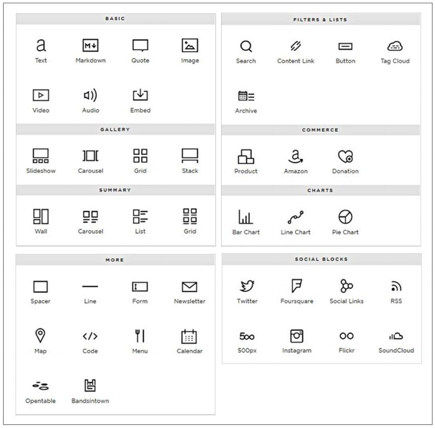
My Big Cartel website was user-friendly for the most part and they had nice themes but there weren't as many customizations as Squarespace offers. With Big Cartel you can add new pages to your website, but adding contents to the page was not as simple as Squarespace. If you had coding knowledge you could code and customize but if you didn't have coding knowledge it made it a little more difficult to do what you wanted quickly. One of the biggest selling points for Squarespace is that their platform is so easy to work with and you don't need coding knowledge to create a beautiful site. You add items to a page by simply clicking an insert point then choosing the type of content that you want to add to that location. This could be an image, video, audio, buttons, products, etc. Customizing a Squarespace website is easy and you can make it look professional without having professional coding knowledge. The image below shows the different types of content that you can add to a page.
image via.
Also, the shop section is so much easier to work with when it comes to listing products. You can easily add multiple variants for your products and assign different price points to them under one listing. In Big Cartel, you could only add one variant, so you would end up having to list the product multiple times to account for other variants (different colors, sizes, styles, etc.).
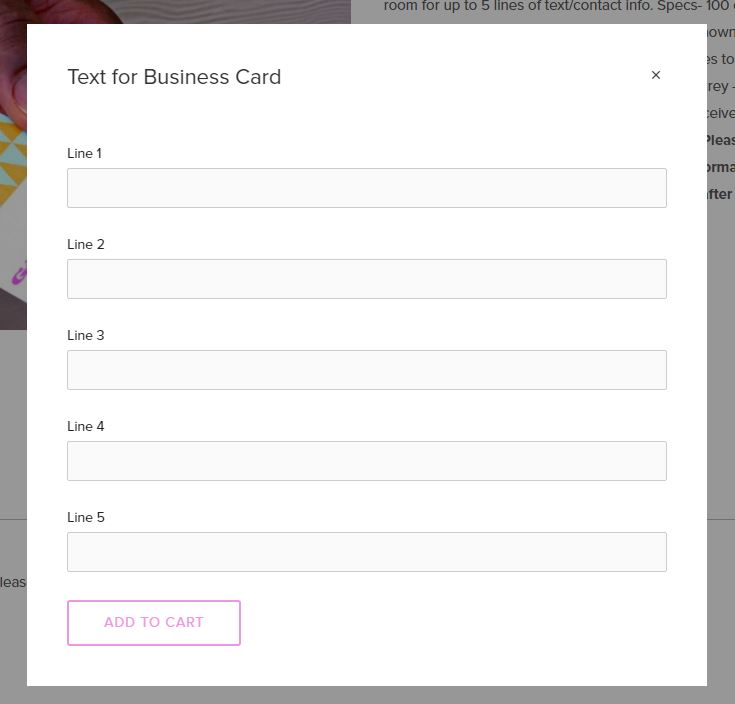
Squarespace also makes it easy to include information when placing an order. For example, if you sell business cards, the customer can enter what they want the card to say in fields that you would create for the listing, so when you receive the order, all of the details are already there. This prevents having to request the customer to send an email to you with their details or you having to contact them to get the information after the order has been received.
3/ Email marketing is built in
As far as collecting email addresses, Big Cartel didn't have a simple way to do it. The only thing that I was able to do was add a generic MailChimp form by embedding it on a new page. It wasn’t cute or custom. I was able to collect emails through Blogger by integrating it with Sumome though, so that was helpful. I also embedded the MailChimp form in my sidebar, but again, ew. I was pleased to find that Squarespace has a newsletter block option, so you can insert an opt-in form anywhere on your website (you can even turn it into a button and make it work like a Leadpages LeadBox). The newsletter block can be formatted to match your branding thus creating a consistent look across your site. To take this a step further you can also link your new subscriber details to your MailChimp list automatically. If you use a different email service provider, you can save the emails into a Google sheet automatically from Squarespace and create a Zapier zap that will magically add the new member to your email list.
Another cool option is the announcement bar. True, it can be used for making an announcement. Even better though...you can turn it into a link and redirect people to your opt-in page.
4/ Easy to add a favicon
A favicon to me is an accessory to your website similar to a pair of earrings-- you feel naked when you're not wearing them. A site without a favicon might as well be naked in my book. In order to add a favicon to Big Cartel, you had to paste some code directly into the main HTML page for your site. This could be a nightmare if you’re not great at coding. Squarespace makes it simple for you to add a favicon and allows you to upload a .png or .ico file (some platforms only allow you to upload a .ico file of a specific size).
5/ Totally customizable
There is so much that you can customize in a Squarespace website! You can change fonts, colors, spacing, logo location, navigation bar location, etc. You can also create landing pages, contact forms, show your business location on a map, show a menu and MUCH much more. The simplicity of Squarespace is that you can drag-and-drop to change a layout so if you have your page set up a certain way and you want to move an element from one place on the page to another, just simply click it and drag it to its new location. You can also customize your blog post URLs so that they are less generic and more clean (i.e. easier to share). You can choose the format of the post URL, for example you can include or exclude the post date. I chose to exclude it from my URL because I want the post link to be short and sweet.
6/ Hidden + unlinked pages
The unlinked page feature is by far my favorite thing in Squarespace. In Big Cartel, with every new page that I created you could see a link to it in the navigation bar. With Squarespace you have the option to hide active pages so that the link does not appear in the navigation. This is such a great option because I don't want every page that I create to appear in the navigation. For example I have a free resource library which does not have a link in the navigation because it's not something that I want everyone to see. There is an unlisted URL for this page and the only people that know what it is are the people that signed up for access to it. I also have hidden pages that are sales pages for courses, opt-in/landing pages, pages that I redirect people to from blog collaborations, blog category pages and social media landing pages. I easily have 30 pages on my website that are hidden (the image below only shows a small portion of them) and they all serve different purposes.
7/ Can host a live webinar
Speaking of unlinked pages, you can host a live webinar on Squarespace. All you have to do is create a new page and embed the code that links directly to your live stream. I have tested this out and it works well. If you host webinars this is a great option because Squarespace makes it simple for you. I wouldn't be able to host a webinar on Big Cartel as easily. I would have had to figure out a way to make it work and it would probably take a while to do (more coding!). Again, Squarespace makes things so much easier to get the job done.
8/ Easy to create password protected pages
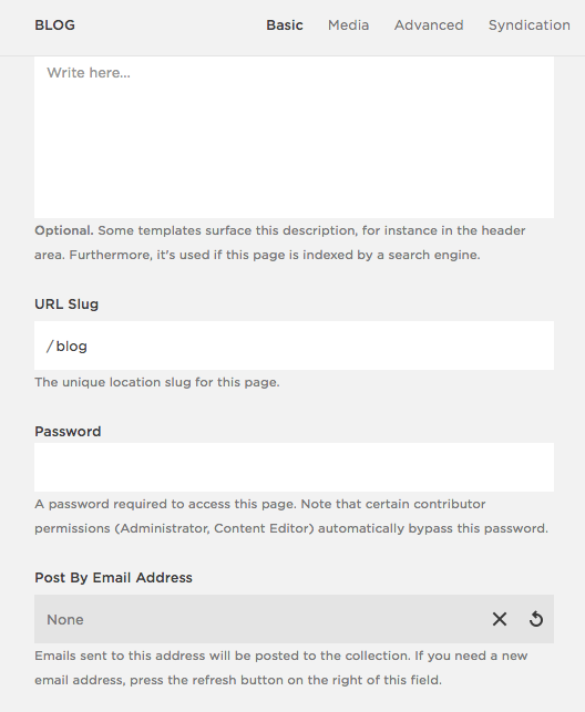
You can make any of your pages password protected so if you have a page that you only want members to access you can create a password so that it will be off limits to everyone else. I do this for my free resource library. When someone opts-in, they receive the unlisted URL and login information to access all of the goods. A password protected page can also be good for hosting paid webinars so that when someone signs up for the workshop, you can email them the link and login info for the page that the training will take place on. This is a simple task in the page settings in which you just enter a password into the "Password" field and you’re done. This was not an option for me in Big Cartel.
9/ Looks clean
A beautiful website doesn’t have to be full of design elements. The best sites are clean, use white space wisely and focus more on content. You don’t want your website to be distracting due to too much congestion and STUFF which ultimately would lead people to jump the proverbial ship. It’s best to keep it clean and Squarespace makes this easy to do. Their various template options are all clean and will appeal to your OCD side if you really like order. It’s not called Squarespace for nothing. Each piece of content on a Squarespace site is created in a block and you can move them around to fit with each other like puzzle pieces. Because of this, it's kind of difficult to make a Squarespace site look like trash.
10/ Easy to embed + integrate external contents
If you use other programs for your blog/biz that allow embedding content on your own website, Squarespace makes it SO easy. For example, maybe you use Sumome for lead generation, a SEO plugin, an Amazon store or an Acuity Scheduling calendar. With my former website, I could embed contents, but it wasn’t pretty. The formatting was totally off and I had to find code that would make the format more appealing and flow well with the existing layout. Squarespace is much easier to work with when it comes to embedding contents. Things that I have embedded into my Squarespace website:
Video training
Opt-In forms from external locations
Scheduling calendar
My products from an external commerce site
You can embed so much, and it’s a quick and easy process.
So there you have it, 10 reasons that I love Squarespace so much and why it made more sense for me to switch over from my previous providers. If you have been thinking of switching to Squarespace, I’d highly recommend it. Click here to learn more about Squarespace and what they have to offer! If you have any questions about Squarespace and other things that you can do with it, ask me in the comments below! I'd love to help ya out!


