I have been on the Squarespace train since January and I am still learning new little tricks here and there. One of my favorite things about Squarespace is that you can create unlinked pages. My former website platform (Big Cartel) didn't allow this, so every page that I created had a link that appeared in either the header or footer navigation. This was annoying because I didn't necessarily want visitors to see every page that I created. Once I switched to Squarespace and saw that there was a section of the "Pages" page that was called "Not Linked", I knew that this was the platform for me! As I began building my site, I was coming across various uses for these types of pages, and I keep thinking of more! Today I will be discussing 9 uses for these beloved pages that you may consider applying to your own site. As a note, this is from a Squarespace perspective, but you can create unlinked pages on Wordpress and Blogger as well. I think it may just be easier and faster in Squarespace (especially comparing it to the process in Blogger which was my blogging platform before the switch)!
1 | Sales Pages
Sales pages are pages that you discuss details of, show examples of and place testimonials on with the intent to sell a product, service, session, etc. For example, maybe you are going to be launching a new product line and want to go into great detail on why the line is so amazing and why the potential customer needs it in their life. This page is dedicated to those efforts. You may not want to have every single sales page that you create visible in your navigation because you may want to promote it to a certain audience that is a little different from your core, or you may not want to look like a "taking" site asking for sales on every page rather than being a "giving" site and providing valuable content. Either way, this is a perfect way to do so! You can create a regular page as a sales page with your navigation bar being visible, or you can create a cover page which is a blank page sans navigation bar that can look like a totally different site (you can customize the sales page colors and font differently from your site-wide settings!) .
2 | Sign up/Opt-in Pages
You may already know about the popular opt-ins such as a pop-up, top bar and embedded form, but why not create a dedicated page for opting in? For example, I have three hidden pages that are solely opt-in forms and I use them as a place to direct people from social media to quickly sign up for my lists. Here's one of the pages that I created to do just that www.colorhug.com/freebie-signup This is a great way to track traffic and sign-ups from social media since it can be a little difficult to track where your peeps are coming from.
(psst...For more info on various types of opt-in forms and how to choose the best ones for your site, check out this post)
3 | Collaboration Opt-in Page
Similar to the previous point, you can also create a separate opt-in page to track conversion from sites that you may have collaborated with. For example, if you collaborated with another blogger on a post and you are offering an opt-in freebie to their audience, you can create a hidden page for their readers to sign up on. By doing this you are able to create a custom experience for the readers because you can use copy that is directly related to the post that you collaborated on, or you can simply greet them as a (Blog Name) Reader (ex: "Hello there, Color Hug Readers!"). The custom copy will give readers the warm and fuzzies because humans love to feel loved :)
4 | Webinars + Masterclasses
You may have sat in on a free webinar or two (or 50+ like me) lately. Conveniently, you can host your own webinar on a hidden page! All that you will need to do is embed the code where your live webinar will be hosted directly onto the page and VOILA! You can do the same for paid masterclasses, which can be a live or pre-recorded training session that is set up the same way as a webinar is set up. You would just need to make the page password protected so that members that paid are the only ones that can access it. You can also place webinar replays on hidden pages and offer them as an opt-in freebie to boost your email list!
5 | Members Only Pages (free and paid)
Members only pages are great because you can have a page dedicated to members of your email lists with exclusive information that only they can access. These pages can hold documents (such as my free resource library that is password protected), videos, photos, or anything else that you want to provide to members. As mentioned in the previous point, they can also be pages dedicated to live masterclasses and replays. You can even use these pages to offer "office hours" sessions a few times a month to people that pay for that service or if a product bundle that you sell comes with Office Hour sessions. Office Hour sessions are time frames when you are available to a group of members live on video to answer questions or help in any way that you can without having to communicate solely through email or one-on-one. It's kind of like a freestyle webinar.
6 | Thank You/Confirmation Pages
Many lead generation websites offer the option to redirect new list members to another page after signing up for an email list. Hidden pages can be used as a landing page either thanking them for signing up or confirming that they have signed up. The awesome thing about these pages is that you can add so many custom elements to them to further add excitement to the experience. I mean, lets face it, signing up for an email list can be boring sometimes, eh? Why not spice it up with a video thanking new members for joining and telling them what they can expect from you? Or how about including a free surprise document for them to download that they will find valuable and informative? Maybe a bonus audio file? Get creative and think of different things that will make your peeps excited to have joined your list! Even more awesome, you can embed social share buttons to these pages so that people can send your info out via social media. This strategy is a great way to grown an email list.
7 | Product Info Pages
You may be selling an e-book on your website. Awesome! You may have this book listed in your shop, right? Well...do you really want to go into great detail of the awesomeness that your e-book has to offer in a little description box? Nah! Those boxes are meant to pack a punch quickly. If you want to give people the option to read more about your e-book (or any product) and see it in action, you may want to create a dedicated page to go into further detail if they are interested in knowing more. It wouldn't quite be a sales page, but it would serve similar purposes as one.
Another great way to use a product information page is if you offer services or products that do not fully go with your websites overall direction, but you still want to generate extra income. For example, you may be a Zumba instructor and your website focuses on various workout routines and video downloads. You may also know a thing or two about paleo lifestyle and have some recipes that you have created that are pretty delicious. You may still want to promote that download separately from your Zumba focus, so a hidden page would work great! You may be a business coach that happens to be an awesome Graphic Designer. You may not want to show your portfolio to everyone, just to potential design clients. Boom! Hidden page.
8 | Blog Categories/Tags
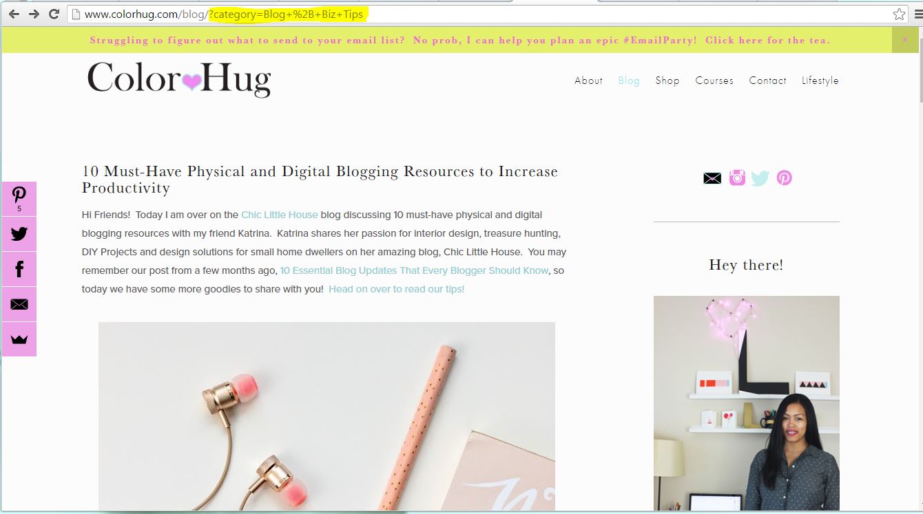
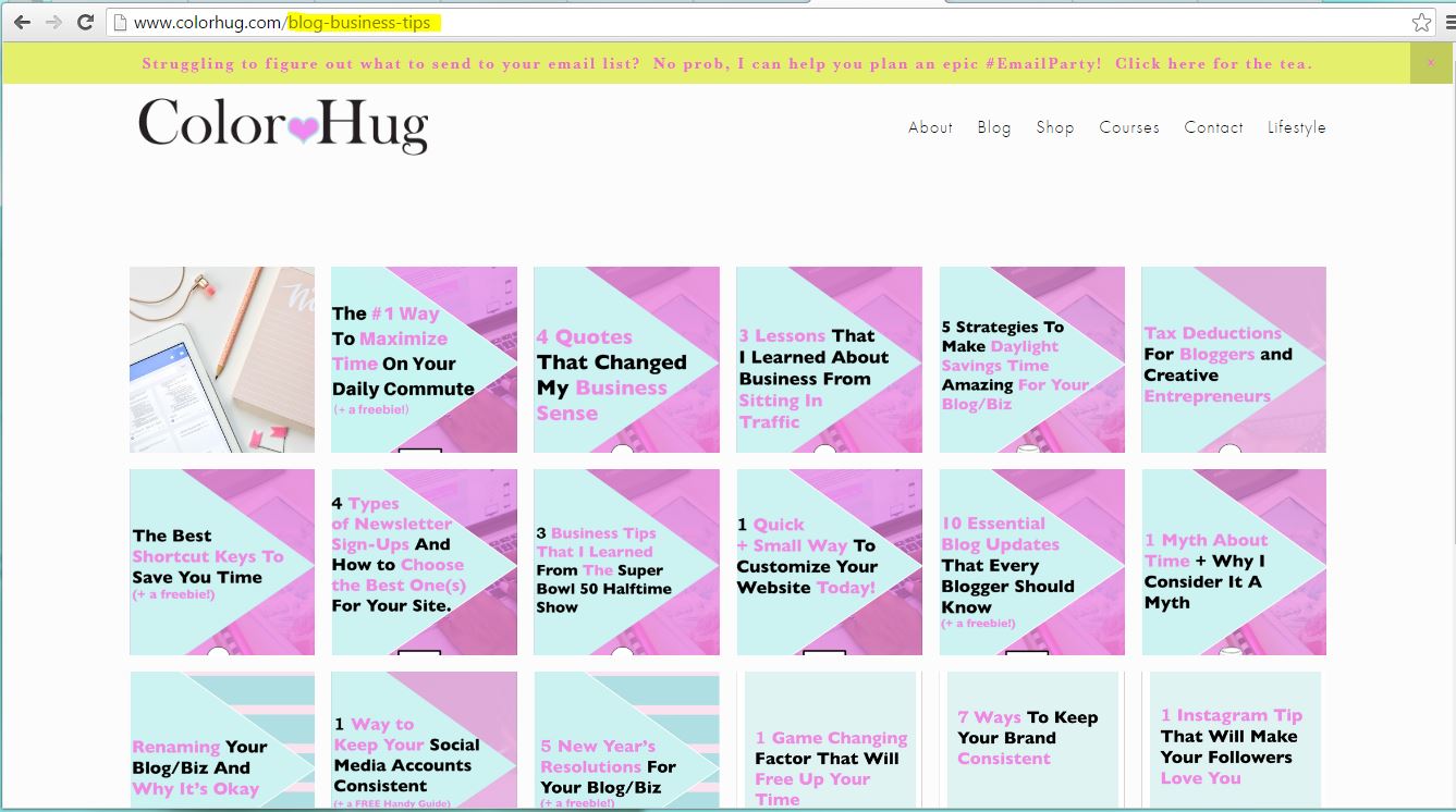
If you blog about various topics but a reader wants to view posts associated to just one topic, a category index page is something great to make! I will use my site as an example. If you just want to view all posts filed under the "Blog + Biz Tips" category, you can view them all on a hidden page that is at www.colorhug.com/blog-business-tips. Traditionally, when you view a specific category on a blog, your results are filtered so that you are only seeing posts in that category, but you are still viewing the posts in your regular blog format. This means that you have to scroll down the page before reaching the next post. Also, the URL is long and messy.
By creating an index, you can add all posts related to a category to one unlinked page then show the thumbnail images and post title (or whatever you decide to show) so that it looks visually appealing/interesting. Readers can also see ALL posts at once in a grid format (or whatever format you choose) and click on what they want to read. The other bonus is that you are able to make a clean, custom URL which makes it easier to share.
Psst...interested in free video training on how to create one of these for your blog? Click here to get access!
9 | Social Media Landing Pages
Gone are the days where it's difficult to track traffic from your social media profiles. This tip is something that Lauren Hooker from Elle and Company spoke about and it was such an AMAZING idea! It's too good not to share. The concept is to create a page that you want your social media visitors to land on when they go to your site from your social profiles. The page is a little summary of who you are, what you do and only little pieces of content that you want them to see so that they can get the gist of what to expect from your site. Essentially you are controlling their experience on your site by directing them where you want them to go rather than them having to click around your site and potentially get lost in the shuffle. The thought behind this is that people will likely be viewing your site on a mobile device if they are looking at a social feed, so you want the experience to be seamless and straight to the point. This is why it's crucial to have a website that is mobile optimized.
You can also track visitors from your social accounts because you will see the hidden page as the entry page in your analytics. The absolute best thing about this, though, is that you don't have to constantly update your URL in your social profiles every time you publish a new blog post! If you include your latest 5-10 blog posts to your custom page as a scrolling index, visitors will always see the latest posts! This is SUCH a time saver, ya'll! I used to change my URL on twitter and Instagram every time I published a new post, and sometimes I would forget to because...sleep deprivation, lol. Using this strategy, I no longer have to worry about this...it's all done on auto-pilot, and you know how I feel about automation! The page that I created as my social landing page is www.colorhug.com/hello, and I only have a blurb about my business, my recent blog posts and a newsletter block so that visitors can sign up for my list. If they want to see more, sure they can look around, but the most important information that I want to share is all that they see initially.
There are so many options for these pages. You can show images of physical or digital products that you sell, link to course pages, link to specific or popular blog posts, etc. It's all on what you want your viewers to experience!
So go on...make some amazing and useful unlinked pages! I would love to hear if you currently use hidden pages on your site and their purpose or if you have a few ideas now churning in your mind of what hidden pages to create. Share in the comments below!


