A social media bio is incredibly important. It’s a snapshot of who you are (your name/handle), what you do (your bio) and where people can find out more about you (your URL). The problem is, when you have various aspects to your brand, driving traffic to your home page may not yield the best results (i.e. sales or email subscribers). You only have the option to include one link on your social profiles (and you can't add links in descriptions on Instagram), so you should maximize that link as much as you can. Today I will be discussing two ways to maximize the URL on your social media bio’s in Squarespace by creating dedicated social media landing pages.
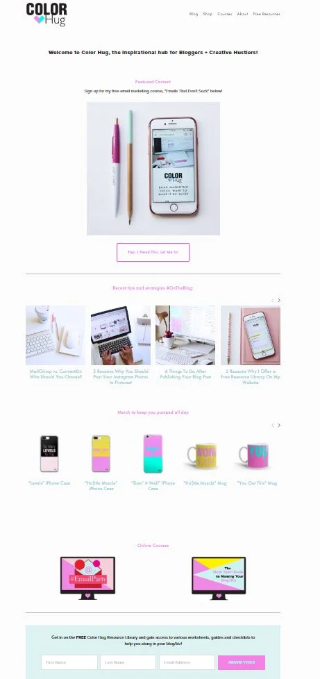
When you only have the option to add one URL to your social platforms, the best way to maximize it is to create a dedicated landing page on your website that will contain only the information that you want visitors to be guided to in order to eliminate distractions. I first heard of this concept by Lauren Hooker of Elle and Co. She suggested creating a page just for social media visitors and only including information on that page that you want them to see. The link for the page would be something simple like “www.yoururl.com/social” and you would control their experience by leading them where you want them to go. For example, I had a landing page that contained a blurb about me, all of my current blog posts, some of my products for sale and a way to join my email list. Sure, there are more pages on my website than this, but in order to guide the visitors, I included the most important pieces of content from my website and put it on one page. So every time someone clicked the #linkinbio, they would be taken to this page rather than my home page:
By creating a landing page that’s dedicated to social media traffic, I have minimized my blogging process time. This is because whenever I had a new blog post to share on social, I had to change the URL in my bio every time to the new post link...for ALL of my social accounts. That process was a time suck for me. Now that all recent posts are on the landing page, there should be no reason to have to adjust the bio link anymore (unless you are temporarily promoting something specific such as a course launch or collaboration post).
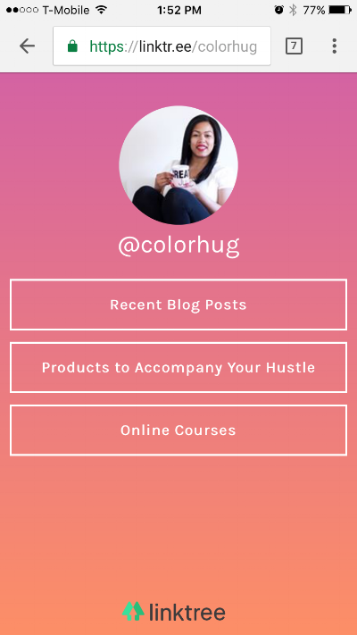
Another way that you can streamline your social URL is to create another type of landing page that contains only links to content or pages. You may have seen this with the platform that seems to be gaining popularity, LinkTree. You have a dedicated URL to use on all social platforms but instead of visually showing content from your site, you would just have a clean landing page full of links or buttons. This is what I choose to do. I have a page called “hey” and it contains links to my blog posts, products, email list signup and email course. I have seen a noticeable increase in traffic to my site from social since tracking analytics is easier when you only have one link that you use on social.
So speaking of Linktree...I don’t suggest using them. Why? The main reason is that you aren’t getting the traffic! Your URL with Linktree goes to their servers; you only get traffic if someone decides to click on of your links from Linktree. If you make your own landing page, you will be getting the social traffic which means more pageviews for you! Another reason I say Linktree is a no-no is because the page doesn’t include your branding. I’m a stickler for branding and I don’t like that Linktree has it’s name all up on the URL (for example, mine is linktr.ee/colorhug) and that their logo is at the bottom of the page. Also, there are limited color template options to choose from, so if you’re using the free version (like most people), your Linktree page is going to look completely identical to other people’s pages. Not Unique = Not Good. They also have very basic analytics; you have to pay for more advanced analytics. Squarespace analytics are built right in.
The first image below is my Linktree landing page and the second is the one that I created in Squarespace .
You can immediately see a difference because one don't have my logo, doesn't contain my brand colors or fonts and the URL is not mine. No good!
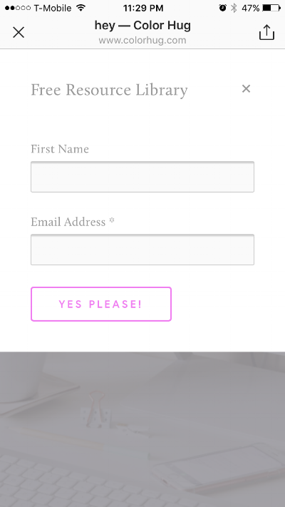
Another fun thing is that I created a button on my Squarespace landing page to sign up for my free resource library. The best thing about this is that the opt-in form pops up right on the window when it’s clicked rather than redirecting you to a different page. Linktree can’t do that. Ease of process is key when trying to convert visitors to subscribers, so the less steps/redirects the better.
This is what appears on screen when someone clicks the "Free Resource Library" button:
So do you want to know how to create your own "Better than Linktree" landing page specifically for social media visitors? Great! I’m going to cover how to do this in Squarespace. I’m sure that this can be done in Wordpress, however, I am not experienced in Wordpress design. You would essentially create a new page and just add links/buttons to it that redirect to the appropriate pages. This is the best advice I can give Wordpress users other than searching for “how to create a new page on my wordpress website” :)
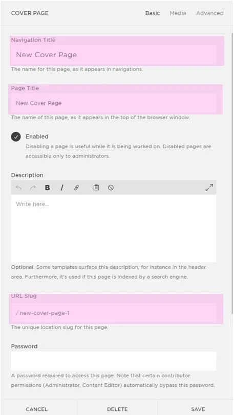
The Process
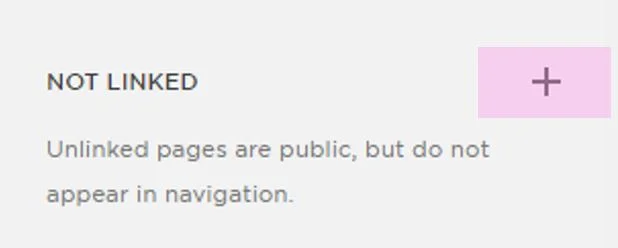
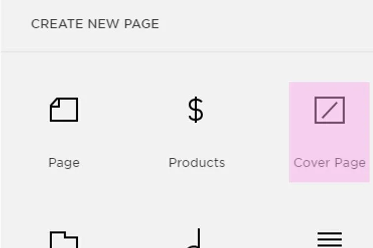
1. Create a new “Not Linked” page in Squarespace
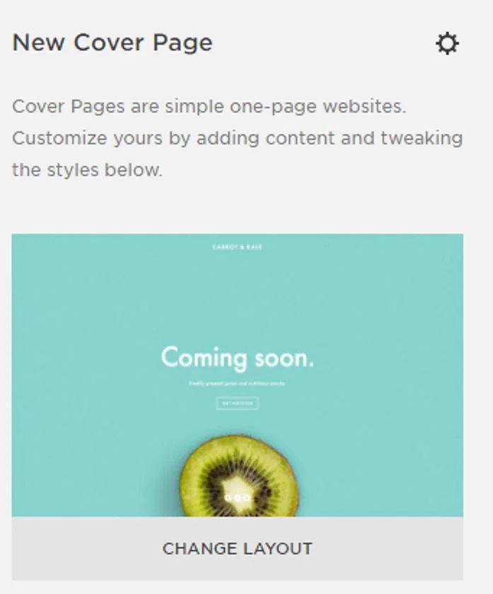
2. Choose “Cover Page”
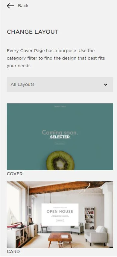
3. Click "Change Layout" to choose the Layout that you want. I used “Card” for my page.
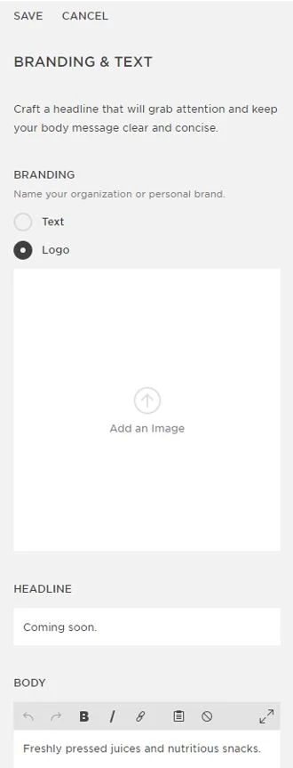
4. Branding and Text- This is where you can upload your logo, image of yourself or whatever image you want to appear on your page above the links. I used my logo here. This section is also where you can include a brief greeting to visitors if you’d like.
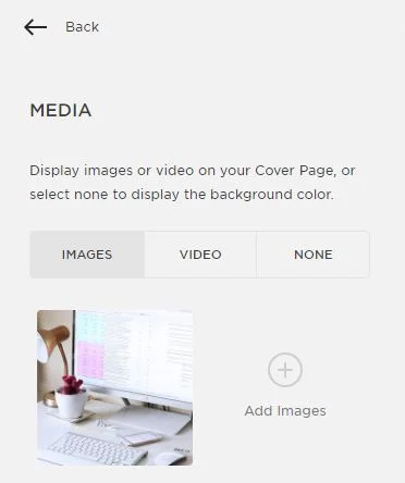
5. Media- you can upload a background image or video or just keep it a solid color.
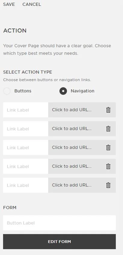
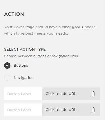
6. Action- This is where you will add all of your links/buttons. You have the option to either include buttons or navigation. If you choose buttons, you can only add a maximum of two links and navigation is a maximum of five links.
Navigation- Click "Navigation" under "Select Action type" then add the link names to the white "Link Label" box. Next, click "Click to add URL" to enter the link to the page that you are linking to.
Buttons- Click "Buttons" under "Select Action type" then enter the button label in the “Button Label” box. Next, add the link to the page or content that you want the button to redirect to (the grey “Click to add URL” box).
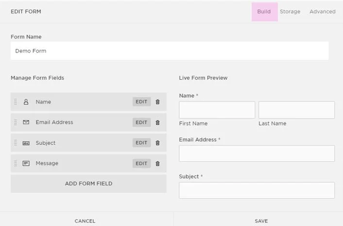
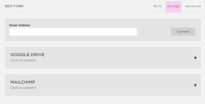
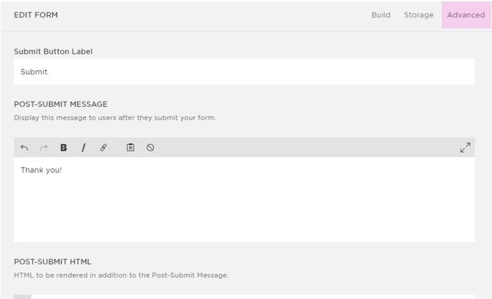
Form- If you want to add an email opt-in form, you can do this by adding a button label to the white “Button Label” box under the “Form” section. You would then click “Edit Form” to create all of your form settings (name, email address, storage details, post-submit message, etc.). Once your form is set up, click save.
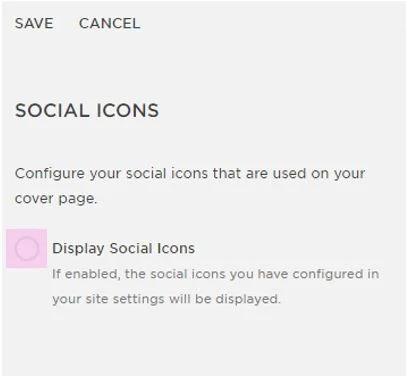
7. Social Icons- you have the option to include your social icons on this page, but I don’t suggest doing this because it will distract visitors and is somewhat redundant since the traffic is coming from a social channel.
8. Style- this is where you can adjust your fonts, sizes, colors, button styles, etc. Once you have designed a layout that you like, click Save.
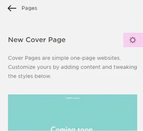
9. Now you just need to shorten your URL to make it easy to read on social. Click the gear icon to display the new page’s details.
10. Update your Navigation and Page titles, then scroll to “URL Slug” and update this to something short and sweet. For example, my slug is simply “Hey”, so it’s colorhug.com/hey. When you have completed this, click save.
11. Now that your new landing page is ready to go, all you need to do is add the URL to all of your social bios. Voila!
I hope that this post helped open your eyes to the many possibilities of Squarespace and how you can custom tailor your website to work in various situations. Having a dedicated landing page for everyone entering your site from social media is just an overall smart thing to do, especially when you want to track analytics and guide them to specific content.
So do you use Linktree or have a dedicated landing page for social media traffic? Tell me your thoughts in the comments below!


