1 Way to Keep Your Social Media Accounts Consistent + a FREE Handy Guide

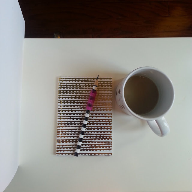
Hello there!  Hope your week is off to a great start.  I've been putting the finishing touches on my new website and blog platform and am excited to launch!  During this process, I had pictures taken for my profile page (I was overdue for new photos) and intended to use them for my social media profile pics as well.  Just a tip...

...you should be using the same profile picture across all social media platforms to keep a consistent and recognizable presence.  The thing about these platforms is that every time I want to change my profile pics or import a new header, I have to hunt down what the dimensions are for each site!  You want to use the image dimensions that the site recommends because that is the size that your image will look its best on their platform.  This can get time consuming when you're having to update 4+ social media accounts.

Multiple sites are involved when updating my profile and header photos to the latest and greatest.  Here are a few:

1. Instagram profile pic

2. Twitter profile pic and header

3. Facebook profile and header

4. Pinterest profile pic

5. PayPal invoice

6. Stripe invoice

7. Blog profile pic (and header if necessary)

If you've ever found yourself scouring Google and other sites to hunt down social media dimensions, today is your lucky day!  I have created a handy cheat sheet of social media dimensions for the most popular platforms.  Gone are the days where you have to search for the optimal profile image size on each site; now you can keep this handy guide on your desk as a reference point when it's time to update those profiles!

DimensionsNewsletter.png

Tip:

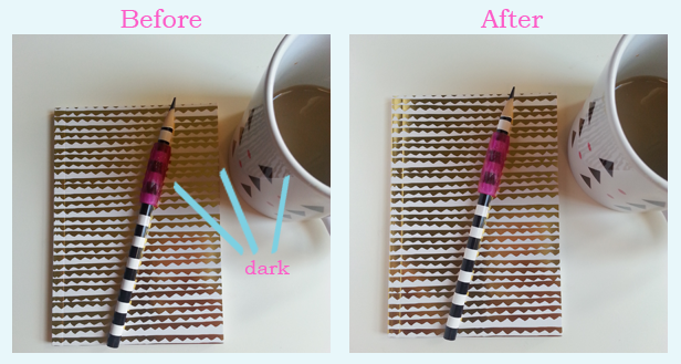
To save even more time, you can create the largest image first so that it can be used across various platforms.  For example, twitter's profile image has larger dimensions than Facebook and is a square, so create the twitter file and use it for Facebook as well (the image will automatically be scaled down upon upload on Facebook).  It's fine for an image to be scaled down, but NEVER try to scale a smaller image up; the results will be unfavorable (i.e. grainy, pixellated, etc.).

Click to gain access to this handy FREE Social Media Dimensions Cheat Sheet as well as other forms, checklists and guides for bloggers and creatives!

1 Genius Item To Keep With You At All Times For Mobile Photography

Today I'm excited to share one super easy, super quick tip that will change the way you take photos on your phone!  Mobile Photography is essentially micro photography, so thinking about it in that sense you will want to use common photo equipment in a portable, micro form.  For example, you can use a small flashlight to add extra lighting to a dark image without using the dreaded flash.  The flashlight would take the place of a bulky lighting kit.  Even better than that, there is one genius thing that you can do that will solve a common photography problem and make your images look more appealing.

Keep a piece of white paper with you and use it as a source to create fill light!  Often times when you are taking photos there can be either extreme highlights or harsh shadows.  You can get rid of them by holding a piece of white paper next to the object being photographed and the light will reflect off of the paper back onto the object and "fill" in the dark/light areas.  This is actually a photography technique, but is usually achieved by using Board Reflectors.  They're quite large though, and who is going to carry one of these boards around with them all of the time?  If you just make sure that you always have a piece of white paper with you, you can achieve the same result.  Lets take a look at this in action.  As a note, I didn't apply filters to these images, they were taken straight from my phone so that you can see the raw image with only the help of the fill light.

This image was taken without fill light from the piece of paper-

See how dark the image is, especially around the top and middle?  It needs a more even distribution of light, and the shadow on the mug is just gross.

This image was taken with fill light from a piece of paper held up on the left side.

The image is brighter overall and the shadows have decreased!  The mug looks so much better and you can see more of the pencil.

Here are the same images side by side-

This is my setup to achieve the shot-

Super easy!  A rule of thumb is to hold the paper up across from the light source, so if the sun is shining in from the right, hold the paper up on the left.  Depending on your light source and the look that you want to achieve, you may want to move the paper to a different location, so just play around with it until you get the results that you want!

Bonus Tip: You can use another piece of paper on the other side of the object to create fill light from both sides.  This will brighten up the image even more and may require less post-photo edits which is what I'm all about!  How will this decrease post-photo edits you ask?  The light will be more evenly distributed across the scene which means you won't have to adjust highlights and shadows as much, just the overall exposure and contrast if needed.

Extra Bonus Tip: Don't have a piece of white paper handy?  You can use a thick napkin or any other white object as long as it is large enough to bounce light off of.

I hope this tip will be useful for you and your mobile photography!  If you liked this tip, tweet it out!